
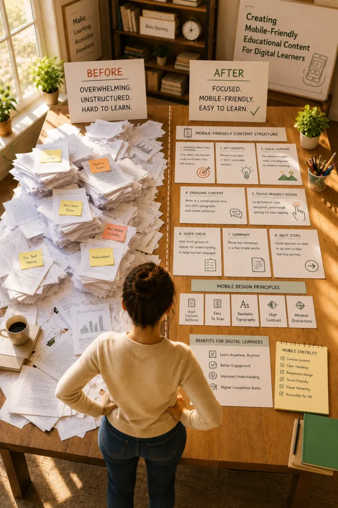
Creating Mobile-Friendly Educational Content For Digital Learners

A growing number of learners access educational materials through smartphones and tablets rather than desktop computers. Users want information to function flawlessly on smaller displays, whether they are taking part in academic courses, professional training, online certification programs, or self-paced learning.

However, educational content that performs well on a desktop environment does not always translate effectively to mobile devices. Long paragraphs, complex layouts, oversized graphics, and difficult navigation can create barriers that reduce engagement and learning effectiveness. Creating mobile-friendly educational content requires thoughtful design decisions that prioritize accessibility, usability, and learner experience.

Why Mobile Learning Has Become Essential

Digital learners often engage with content in different environments than traditional classroom students.

They may access learning materials:

  • During commuting time
  • Between work tasks
  • While traveling
  • In hybrid learning environments
  • Through personal mobile devices

Publishers and instructional designers must make ensuring that instructional content is understandable, useful, and captivating across a range of screen sizes as the use of mobile learning increases.

A positive mobile experience supports learner retention and course completion rates.

Making Navigation Simple And Intuitive

Mobile users interact with content differently than desktop users.

Navigation should be:

  • Touch-friendly
  • Consistent
  • Easy to understand
  • Accessible on smaller screens

Learners should be able to move between modules, activities, and assessments without confusion.

Complicated navigation structures often lead to learner frustration and reduced engagement.

Comparing Desktop-Focused And Mobile-Friendly Content

Desktop-Focused Content

Mobile-Friendly Content

Long content pages

Short learning segments

Complex layouts

Simplified structure

Large navigation menus

Touch-friendly navigation

Fixed-width elements

Responsive design

Desktop-only interactions

Cross-device compatibility

The objective is not to reduce educational value but to improve content accessibility across devices.

Accessibility Considerations For Mobile Learning

Accessibility remains an important part of mobile content development.

Educational teams should review:

  • Readable font sizes
  • Alternative text for images
  • Adequate color contrast
  • Clear heading structures
  • Screen-reader compatibility

Accessibility improvements benefit all learners, not only those using assistive technologies.

Mobile-friendly design and accessibility often work together to improve overall usability.

Designing Content For Smaller Screens

One of the most common challenges in mobile learning is adapting content originally developed for larger displays.

Keep Content Sections Short

Mobile learners typically consume information in shorter sessions.

Best practices include:

  • Short paragraphs
  • Concise explanations
  • Clear headings
  • Logical content chunks
  • Simple navigation structures

Breaking information into smaller units helps reduce cognitive overload.

Prioritize Visual Hierarchy

Important information should be easy to identify.

Effective visual hierarchy includes:

  • Consistent heading levels
  • Clear section breaks
  • Readable spacing
  • Simple page layouts

A clean structure helps learners locate information quickly.

Optimizing Images And Visual Content

Visual elements play an important role in educational content, but they must be optimized for mobile delivery.

Publishers should ensure that:

  • Images scale properly
  • Text within graphics remains readable
  • Diagrams maintain clarity
  • Visuals load efficiently

Large files could impair user experience and hinder performance.

Visual content should support learning objectives rather than create distractions.

Developing Mobile-Ready Assessments

Assessments should be designed with mobile interaction in mind.

Considerations include:

  • Touch-friendly answer selection
  • Readable question formats
  • Responsive layouts
  • Clear feedback displays

Poorly formatted assessments can create unnecessary challenges that interfere with learner performance.

Testing assessment experiences across devices helps ensure consistency.

A Practical Educational Publishing Scenario

A publisher develops a professional certification course intended for both desktop and mobile learners.

Initial testing reveals that diagrams are difficult to read on smartphones, assessment buttons are too small for touch interaction, and lengthy content pages require excessive scrolling.

The publishing team restructures lessons into smaller modules, optimizes visuals for mobile viewing, and redesigns navigation for touch-based interaction.

As a result, learning becomes more accessible, interesting, and device-neutral.

Supporting Learning Wherever Learners Are

In educational publishing, mobile learning is no longer a secondary factor. As learners increasingly access educational resources through smartphones and tablets, publishers must create content that remains accessible, engaging, and effective across devices. By combining responsive design, accessibility principles, and learner-focused content structures, organizations can deliver educational experiences that support learning anytime and anywhere.

Frequently Asked Questions

It is educational content designed to function effectively on smartphones, tablets, and other mobile devices.

Many learners now access content through mobile devices, making mobile compatibility essential for accessibility and engagement.

Shorter content sections, clear headings, readable fonts, and effective spacing can improve readability.

Responsive design allows educational content to adapt automatically to different screen sizes and device types.

To facilitate a seamless learning process, assessments should incorporate touch-friendly features, flexible layouts, and clear formatting.
