
Common Typesetting Errors in Educational Books and How to Avoid Them

Small Formatting Mistakes Can Create Big Learning Problems

Educational publishers invest heavily in content development, subject-matter expertise, illustrations, and curriculum alignment. However, even the most accurate educational content can become difficult to use when typesetting errors affect readability and navigation.

Students rely on clear page structures, properly placed visuals, consistent formatting, and logical content flow. When these elements are disrupted, learners may struggle to find information, understand concepts, or complete activities efficiently.

Identifying common typesetting mistakes early can help publishers improve content quality, reduce revision cycles, and deliver a better learning experience.

Inconsistent Heading Structures

One of the most common issues in educational books is inconsistent heading hierarchy.

Examples include:

  • Different font sizes for similar sections
  • Inconsistent chapter titles
  • Misaligned subheadings
  • Uneven spacing between sections

When heading structures vary throughout a textbook, students can find it difficult to understand the organization of the content.

How To Avoid It

Publishers should establish clear style guides that define:

  • Heading levels
  • Font usage
  • Spacing standards
  • Color conventions
  • Section formatting rules

Consistent application of these standards improves navigation and content clarity.

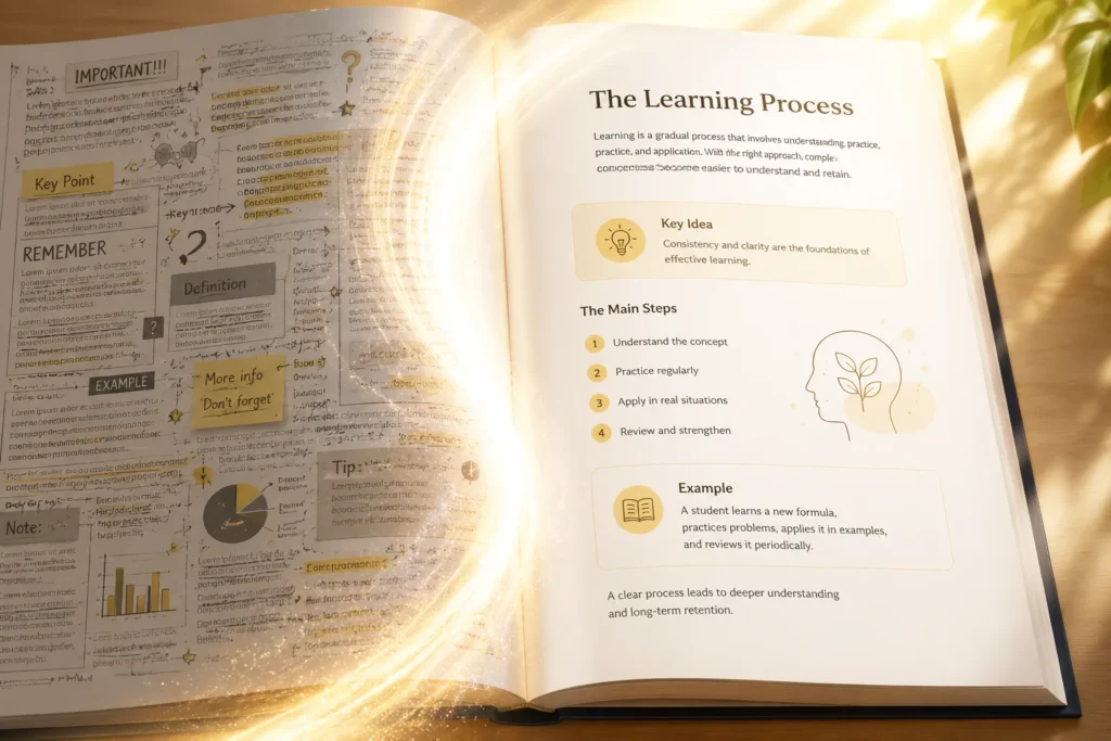
Crowded Page Layouts

Attempting to fit too much content onto a page can negatively affect readability.

Common symptoms include:

  • Minimal white space
  • Dense paragraphs
  • Overlapping content areas
  • Tight margins
  • Excessive visual clutter

While publishers may try to reduce page counts, overcrowded pages often make learning more difficult.

How To Avoid It

Use balanced layouts with adequate spacing between:

  • Paragraphs
  • Images
  • Tables
  • Activities
  • Assessment sections

Strategic white space helps students focus on important information.

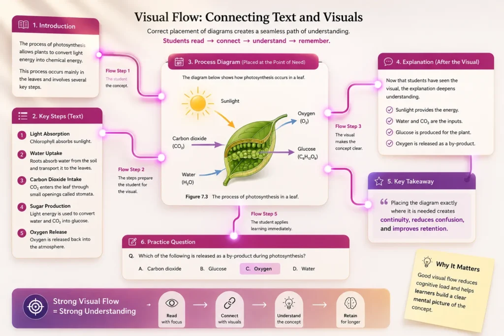
Poor Placement Of Educational Diagrams

Educational books often contain:

  • Scientific illustrations
  • Maps
  • Process diagrams
  • Technical figures
  • Mathematical graphs

A common mistake is placing visuals too far away from the related content.

Students may need to repeatedly move between pages to connect explanations with supporting visuals.

How To Avoid It

Position diagrams as close as possible to the relevant text and ensure captions clearly explain the purpose of each figure.

This creates a smoother learning experience and reduces confusion.

Table And Equation Formatting Errors

STEM publications frequently contain complex:

  • Mathematical equations
  • Scientific formulae
  • Technical tables
  • Statistical data

Even minor formatting inconsistencies can affect interpretation and accuracy.

How To Avoid It

Implement specialized review procedures for:

  • Equation alignment
  • Symbol consistency
  • Table formatting
  • Unit presentation
  • Data structure validation

Technical content should always receive additional quality checks before publication.

Inconsistent Assessment Formatting

Educational books often include:

  • Multiple-choice questions
  • Exercises
  • Quizzes
  • Practice activities
  • Review sections

When assessment formats vary unexpectedly, students may become confused about instructions or expectations.

How To Avoid It

Create standardized templates for all assessment types and apply them consistently throughout the publication.

Consistency helps students focus on answering questions rather than interpreting layouts.

Pagination And Cross-Reference Issues

Cross-references play an important role in educational materials.

Problems commonly occur when:

  • Page numbers change during revisions
  • References point to incorrect chapters
  • Figure numbers become inaccurate
  • Index entries are not updated

These errors can frustrate both students and educators.

How To Avoid It

Maintain a structured review process that verifies:

  • Page references
  • Figure references
  • Table references
  • Index links
  • Chapter numbering

Final validation should occur after all production changes are completed.

Common Errors Vs Best Practices

Common Error

Recommended Practice

Inconsistent headings

Use standardized style guides

Poor diagram placement

Keep visuals near related content

Crowded pages

Maintain adequate white space

Equation formatting issues

Perform technical content reviews

Assessment inconsistencies

Use structured templates

Broken cross-references

Conduct final validation checks

Building Strong Quality-Control Processes

Most typesetting errors are preventable when publishers implement structured quality-control procedures.

Effective review processes typically include:

  • Style consistency checks
  • Layout validation
  • Diagram review
  • Pagination verification
  • Technical content checks
  • Final proof reviews

Quality assurance should be viewed as an essential publishing stage rather than a final administrative task.

Ignoring Digital Publishing Requirements

Many educational publishers now distribute content in both print and digital formats.

A layout that works well in print may create usability challenges on digital devices.

Potential issues include:

  • Poor screen readability
  • Inconsistent navigation
  • Oversized tables
  • Difficult-to-read figures
  • Unstructured digital layouts

How To Avoid It

Plan publishing workflows that consider both print and digital requirements from the beginning of the production process.

This helps ensure a consistent learner experience across multiple platforms.

Preventing Errors Before They Reach The Classroom

Typesetting is much more than arranging text on a page. It directly influences how learners interact with educational content. By addressing common formatting mistakes, maintaining consistency, and implementing strong quality-control procedures, publishers can create educational resources that are easier to navigate, easier to understand, and more effective in supporting learning outcomes.

Frequently Asked Questions

Inconsistent formatting and heading structures are among the most frequently encountered issues.

Students understand content more easily when diagrams appear close to the related explanations.

Using clear typography, consistent layouts, balanced spacing, and structured content hierarchy can significantly improve readability.

Quality-control reviews help identify formatting, layout, and reference errors before publication.

STEM textbooks, technical manuals, higher education publications, and assessment-heavy learning materials often require the most detailed typesetting review.
