Print vs Digital Publishing: Why Professional Typesetting Still Matters

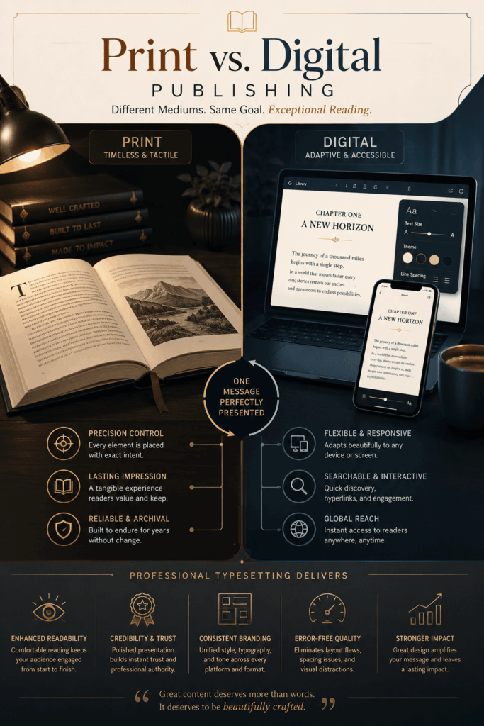
Over the past years, the publishing scene has undergone significant change. Readers now consume content through printed books, smartphones, tablets, e-readers, websites, and interactive digital platforms. While technology has made publishing more accessible than ever, it has also increased the importance of presentation and readability.
Many people assume that advanced software and automated formatting tools can completely replace professional typesetting. However, whether content appears in print or digital form, carefully structured typography and layout still play a major role in how readers experience information.
Professional typesetting continues to be one of the most valuable elements in modern publishing because it improves readability, strengthens brand credibility, and creates a polished reading experience across every medium.

Understanding the Difference Between Print and Digital Publishing

Although both formats share the same goal of delivering content to readers, print and digital publishing function very differently.

Print Publishing: Fixed and Controlled

Printed publications operate within a fixed layout environment. Designers and typesetters control every visual detail, including margins, spacing, page numbers, line breaks, and image placement. Once printed, the layout remains unchanged for every reader.

This precision allows publishers to create visually balanced pages with carefully managed typography and structure.

Digital Publishing: Flexible and Responsive

Digital formats are designed to adapt across multiple devices and screen sizes. Readers can enlarge fonts, switch between dark and light modes, rotate screens, or access content on mobile phones, tablets, or desktops.

Because digital layouts constantly reflow, content requires thoughtful formatting to ensure readability and consistency on every platform.

Without professional typesetting, digital publications often suffer from:

  • uneven spacing
  • poor line breaks
  • distorted layouts
  • inconsistent formatting
  • visual fatigue during reading

Why Professional Typesetting Still Matters

Professional typesetting is not simply decorative. It combines visual structure, readability science, and user experience design to help readers engage with content comfortably and efficiently.

Well-formatted text reduces strain on the eyes and helps readers absorb information more naturally.
Professional typesetters carefully manage:
• line spacing
• paragraph structure
• font hierarchy
• character spacing
• margin balance
• line length
Both in print and digital modes, these minor changes significantly increase reading comfort


Readers often judge the quality of a publication based on its appearance before they even begin reading.
A document with inconsistent formatting, crowded layouts, or awkward spacing can appear unprofessional regardless of the quality of its content.
Clean typography and balanced page composition create a sense of authority, trust, and professionalism that reflects positively on authors, businesses, and publishers.

 Digital publishing requires content to display properly across many devices and operating systems.
Professional typesetting ensures:
• stable formatting
• responsive layouts
• proper font rendering
• image alignment
• consistent visual hierarchy
This prevents common issues such as overlapping text, broken paragraphs, or unreadable mobile layouts.

Automated formatting tools frequently overlook subtle but important layout errors.

Professional typesetting helps prevent:

  • widows and orphans
  • uneven paragraph spacing
  • large white gaps in text blocks
  • inconsistent alignment
  • poor page flow
  • broken image positioning

Correcting these details creates a smoother and more polished reading experience.

Comparing Print and Digital Publishing

Feature

Print Publishing

Digital Publishing

Layout Structure

Fixed and controlled

Flexible and responsive

Typography

Precisely defined

Adaptive across devices

Navigation

Page-based

Interactive and searchable

Main Challenge

Print accuracy and spacing

Device compatibility

Reader Experience

Tactile and immersive

Portable and accessible

The Importance of Typesetting in Modern Publishing

Even though publishing technology continues to evolve, the core purpose of typesetting remains unchanged: making content easier and more enjoyable to read.

Professional formatting helps bridge the gap between information and audience by improving:

  • readability
  • visual communication
  • accessibility
  • content engagement
  • publishing quality

Professional typesetting guarantees that the finished product appears polished, well-organised, and reliable whether creating a printed book, digital magazine, technical manual, eBook, or corporate report.

Final Thoughts

Print and digital publishing are not competing systems they are complementary methods of communication. Each format offers unique advantages, but both require thoughtful design and structured typography to succeed.

In a world filled with endless content, presentation has become just as important as information itself. Professionally typeset content creates a stronger connection with readers, improves usability, and reinforces the value of the message being delivered.

No matter the platform, effective typesetting transforms ordinary text into a professional publishing experience.

FAQ

Most frequent questions and answers

Professional typesetting is the process of organizing text, spacing, fonts, images, and layouts to create visually balanced and easy-to-read content for both print and digital publishing platforms.

Even in digital formats, proper typesetting improves readability, prevents formatting issues, and ensures content adapts correctly across devices such as smartphones, tablets, laptops, and e-readers.

Print layouts are fixed and remain identical for every reader, while digital layouts are flexible and responsive, automatically adjusting based on screen size, device type, and user preferences.

Automated formatting techniques are useful for simple layouts, but they frequently overlook crucial issues like layout faults, typographic balance, spacing consistency, and readability optimisation. More accuracy and quality control are offered by professional typesetting.

Professional typesetting enhances reading comfort by carefully managing:

  • line spacing
  • paragraph alignment
  • font hierarchy
  • margin balance
  • letter spacing
  • line length

These elements reduce eye strain and improve content flow.